
If you’ve ever spent hours wrestling with PowerPoint trying to make a methodology diagram look publication-ready, you’ll appreciate what Google Cloud AI Research and Peking University just released. PaperBanana is an agentic framework that automates the generation of academic illustrations—the kind you see in NeurIPS papers, not the kind that scream “I made this in Canva.”
This matters more than it might initially seem. Diagram creation is a legitimate bottleneck in research workflows. It requires skills—visual hierarchy, color theory, alignment precision—that are largely orthogonal to the actual research expertise. A brilliant machine learning researcher isn’t necessarily a brilliant graphic designer, and yet their papers get judged partly on how their figures look.
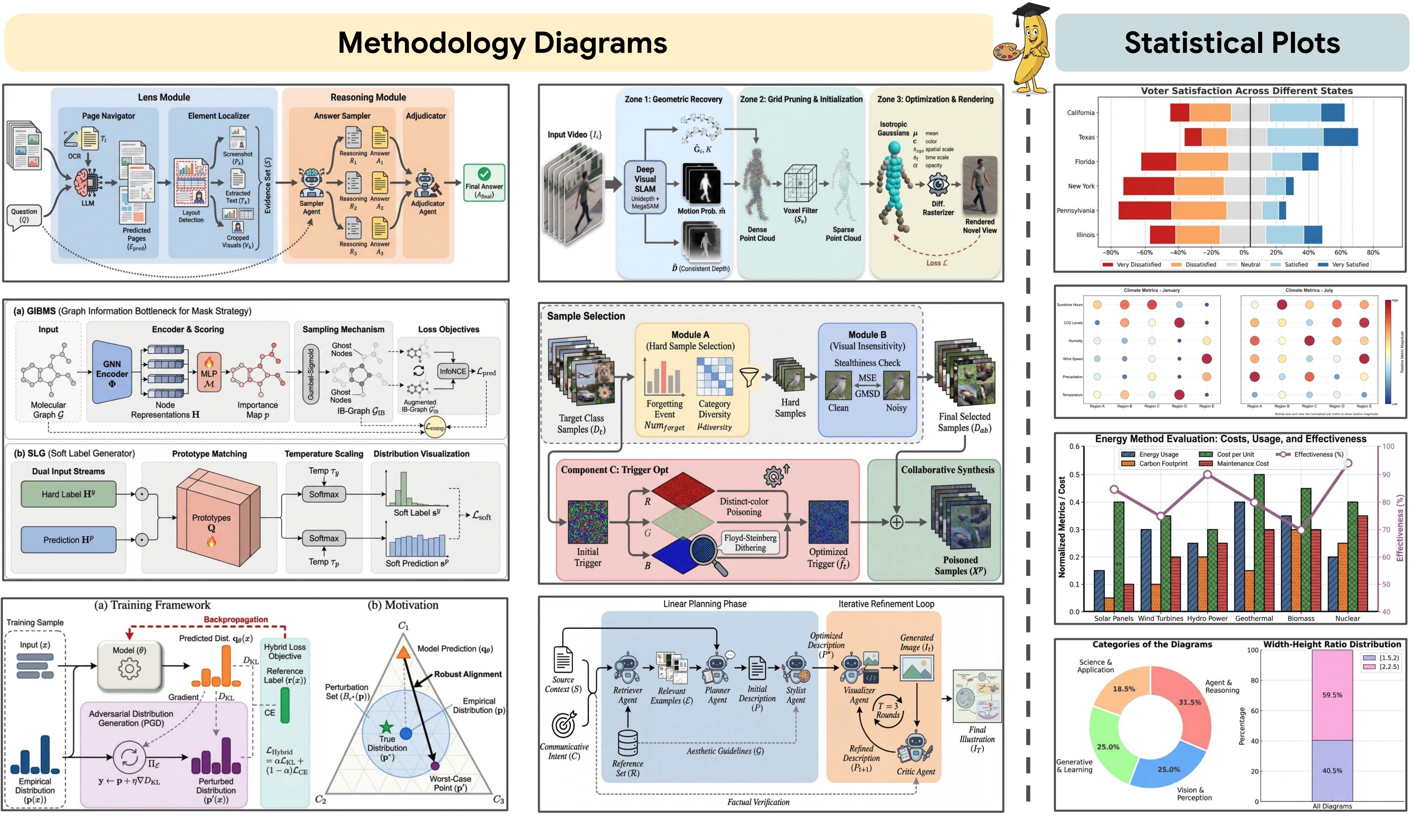 Examples of methodology diagrams and statistical plots generated by PaperBanana, demonstrating the potential of automating academic illustration generation.
Let’s break down how PaperBanana works and why it represents a meaningful step forward for AI-assisted research.
The Problem: Academic Illustrations Are Tedious
Every researcher who’s published knows the pain. You’ve got your methodology figured out, your experiments run, your results analyzed—and then you need to make the figures. The methodology diagram alone can eat an entire afternoon.
You’re not just drawing boxes and arrows. You’re making decisions about:
- Visual hierarchy — What should the reader see first?
- Color schemes — Something that looks professional, not garish
- Spatial layout — How do components relate to each other?
- Labeling — Clear but not cluttered
- Consistency — Matching the aesthetic standards of your target venue
And if you’re submitting to a top venue like NeurIPS or ICML, reviewers will notice if your figures look amateurish. It’s unfair, but it’s real.
Previous AI attempts at diagram generation often produced what I’d call “clip art energy”—generically corporate visuals that look fine in a blog post but completely wrong in an academic paper. The aesthetic standards are different, and most image generation models weren’t trained to understand that difference.
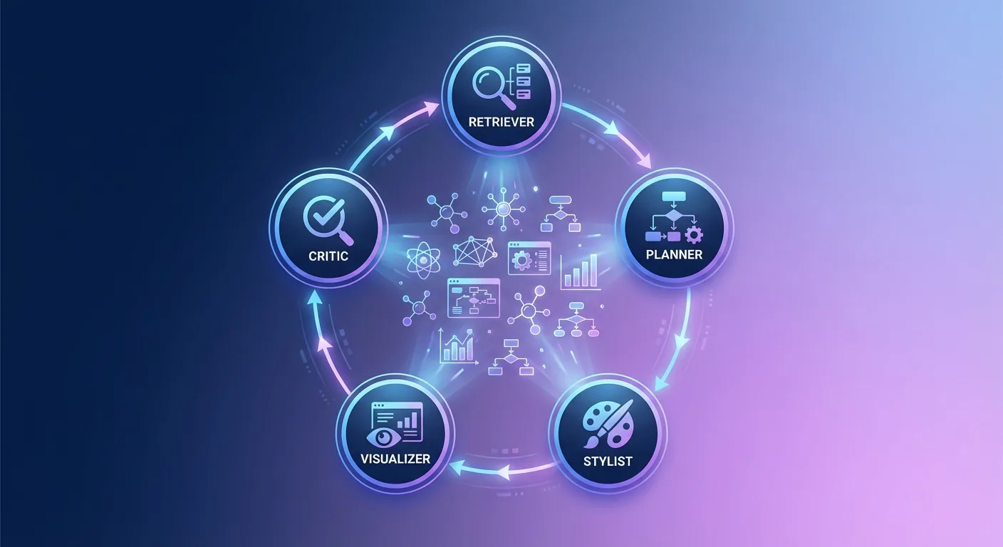
How PaperBanana Works: Five Specialized Agents
PaperBanana’s core innovation is its multi-agent architecture. Rather than throwing a single model at the problem, it orchestrates five specialized agents that collaborate in sequence:
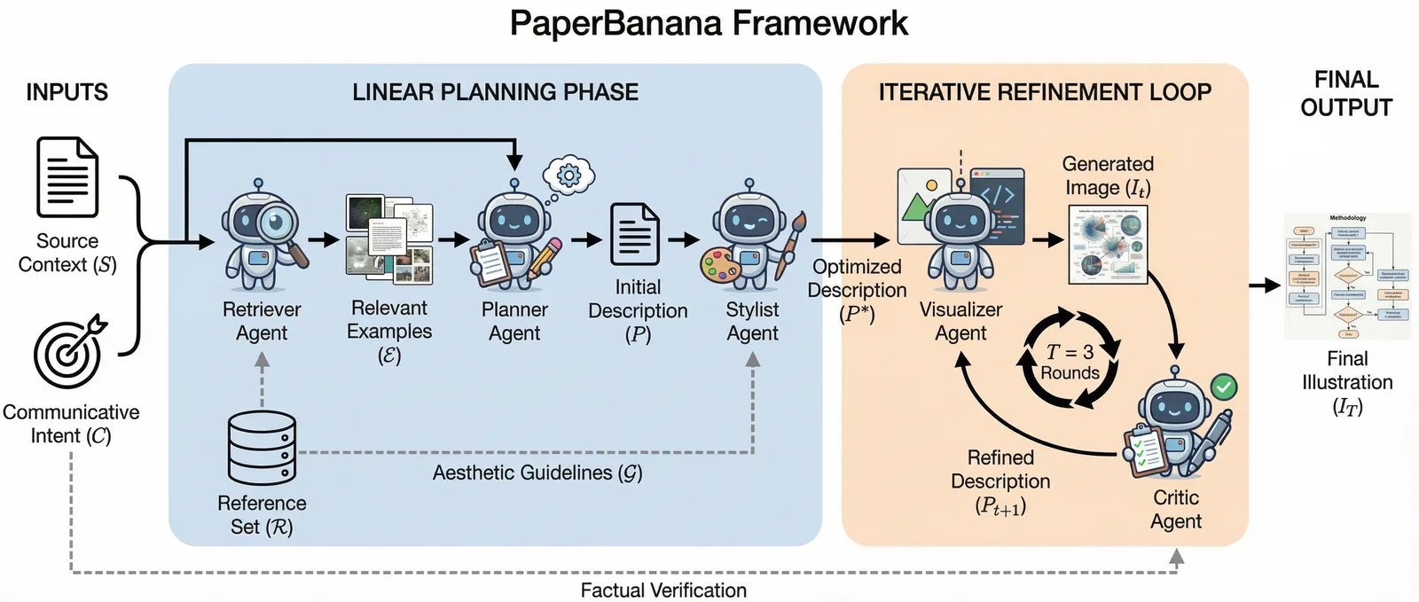 The PaperBanana framework orchestrates five specialized agents—Retriever, Planner, Stylist, Visualizer, and Critic—to transform raw scientific content into publication-quality diagrams.
1. Retriever Agent
The Retriever identifies relevant reference examples from existing high-quality academic papers. This is crucial—it grounds the entire pipeline in what publication-ready diagrams actually look like.
Instead of generating from scratch based on generic training data, PaperBanana starts by finding stylistic anchors. “This is what good methodology diagrams in this domain look like. Now let’s make one that fits.”
2. Planner Agent
The Planner acts as the cognitive core. It takes the raw scientific context—methodology descriptions, paper sections, figure captions—and translates them into detailed textual descriptions of what the diagram should contain.
This is where the semantic understanding happens. The Planner figures out what elements need to be represented, how they relate to each other, and what the logical flow should be.
3. Stylist Agent
The Stylist ensures adherence to academic aesthetic standards by synthesizing guidelines from the reference diagrams the Retriever found. It’s essentially asking: “Based on these examples, what makes a diagram in this domain look professional?”
This addresses the “clip art energy” problem directly. The Stylist doesn’t just apply generic design principles—it learns the specific visual language of the target academic community.
4. Visualizer Agent
The Visualizer does the actual rendering, either generating images directly or producing executable code (TikZ, matplotlib, etc.) that can be compiled into figures.
The code generation path is particularly interesting for researchers who want to make minor tweaks. Instead of a black-box image, you get editable source that you can modify.
5. Critic Agent
Finally, the Critic inspects the generated output against the original source material and provides feedback for refinement. If something’s wrong—a missing element, a misleading visual representation, poor alignment—the Critic catches it and triggers another iteration.
The system loops through self-critique cycles until the output meets quality thresholds. This iterative refinement is what separates PaperBanana from one-shot generation approaches.
PaperBananaBench: A Real Benchmark
One of the paper’s most valuable contributions isn’t the model itself—it’s the benchmark. The team released PaperBananaBench, comprising 292 test cases curated from NeurIPS 2025 publications.
Why does this matter? Because you can’t improve what you can’t measure. Previous work in diagram generation often relied on subjective evaluation or synthetic test cases. PaperBananaBench provides real-world examples from a top-tier venue, covering diverse research domains and illustration styles.
The benchmark construction pipeline includes:
- Collection & Parsing — Extracting figures from published papers
- Filtering — Removing low-quality or non-methodology figures
- Categorization — Organizing by domain and style
- Human Curation — Expert review to ensure quality
The final dataset splits into 292 test cases and 292 reference cases, enabling proper evaluation of reference-driven generation approaches.
Results: Consistent Outperformance
The comprehensive experiments show PaperBanana outperforming leading baselines across four dimensions:
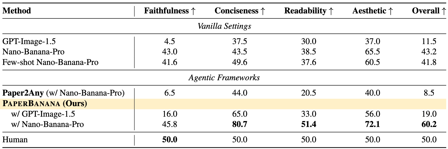 PaperBanana consistently outperforms baselines across faithfulness, conciseness, readability, and aesthetics.
- Faithfulness — Does the diagram accurately represent the source content?
- Conciseness — Is it appropriately simplified, or cluttered with unnecessary detail?
- Readability — Can viewers quickly understand what’s being shown?
- Aesthetics — Does it look publication-ready?
The system also extends beyond methodology diagrams to statistical plots—bar charts, line graphs, confusion matrices. The same five-agent architecture handles both use cases.
Case Study: Vanilla vs. PaperBanana
The difference becomes clear when you compare outputs directly. Given the same source context and caption, the vanilla Nano-Banana-Pro model often produces diagrams with outdated color tones and overly verbose content. PaperBanana generates results that are more concise and aesthetically pleasing while maintaining faithfulness to the source.
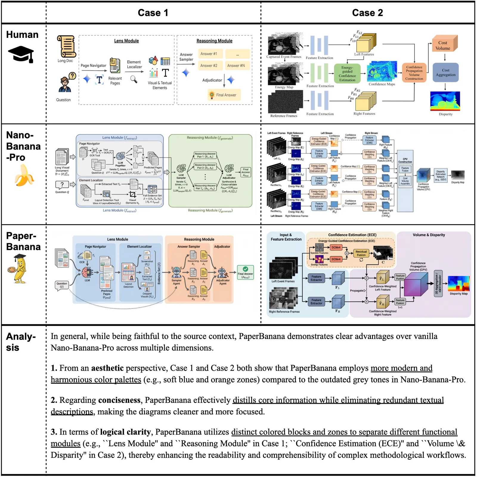 Side-by-side comparison: vanilla Nano-Banana-Pro (left) vs. PaperBanana (right). Note the improved color schemes, reduced visual clutter, and better adherence to academic aesthetic standards.
The Honest Limitations
No system is perfect, and the paper is refreshingly candid about failure modes.
The primary issue is connection errors—redundant lines, mismatched source-target nodes, incorrect flow directions. The Critic agent sometimes fails to catch these, suggesting that the underlying foundation model has perception limitations that agentic orchestration alone cannot solve.
There’s also an interesting tradeoff between code-based and image-based generation for statistical plots. Image generation produces more visually appealing results but incurs more “faithfulness errors”—numerical hallucinations, element repetitions. Code-based approaches are more accurate but sometimes less polished.
Why This Matters for the Future of Research
PaperBanana isn’t going to replace human researchers or even human designers. But it does represent a meaningful step toward AI scientists that can ship complete papers, not just drafts that need human polish on every visual.
The bottleneck in research productivity is increasingly not computation or data—it’s the human time required for tasks that don’t require deep expertise but do require significant effort. Diagram creation falls squarely in that category.
If a researcher can describe what they want and get a publication-ready figure in minutes rather than hours, that’s time freed up for actual research. Multiply that across thousands of papers per year, and the aggregate impact is substantial.
More importantly, this work demonstrates a general pattern: agentic systems that decompose complex tasks into specialized sub-agents, each focused on a specific capability. The Retriever-Planner-Stylist-Visualizer-Critic pipeline could be adapted for other creative and technical tasks.
Getting Started
The paper and project page are both publicly available:
- Paper: arXiv:2601.23265
- Project Page: PaperBanana
If you’re a researcher tired of spending your afternoons on figure design, this is worth exploring. And if you’re an AI practitioner interested in agentic architectures, the five-agent design offers useful patterns for decomposing complex generation tasks.
The age of AI-assisted academic publishing is accelerating. PaperBanana won’t write your paper for you, but it might just make the figures for it.